rethinking the mail client for 2025

Why I Started This Project
I’ve always wanted an email app that felt intuitive, beautiful, and genuinely enjoyable to use. Most email clients out there are cluttered, overwhelming, or just don’t feel friendly. That’s why I decided to take matters into my own hands and design the kind of email experience I’d actually want.
I teamed up with a friend for the development side, and I managed all the branding and UI part. For me, this project was a chance to completely rethink what email could feel like if the focus was on clarity, simplicity, and a bit of playfulness.
Simplicity Above All

From the very beginning, my goal was to make email feel less like a chore. I wanted Ping Mail to strip away the noise and put the focus back on what really matters: your messages.
Simplicity was my north star with every design decision:
- No unnecessary buttons or distracting elements
- No overloaded features
- Just a calm, clean space to manage your inbox
The Story Behind the Logo

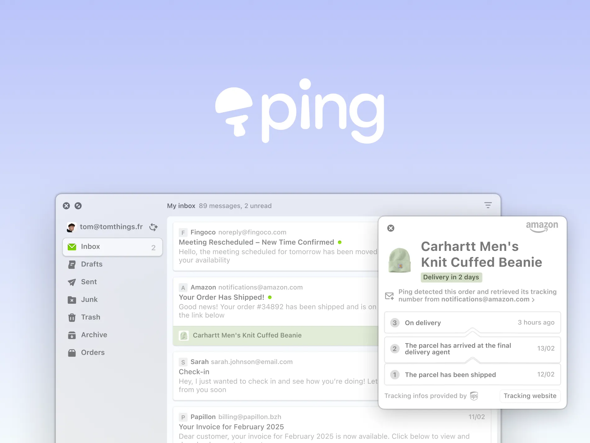
Designing the identity for Ping Mail was just as important to me as crafting the UI. I wanted something simple and memorable, something that instantly felt light, playful, and unique.
The logo combines two main ideas:
- A stylized ping-pong paddle as the icon, created from simple geometric shapes and a bright green color. This immediately hints at the name “Ping” and sets a fun, energetic tone for the app.
- A friendly, all-lowercase wordmark in a soft, rounded font. The black lettering keeps it clean and approachable.
My favorite detail is the dot above the “i”, it uses the same green as the paddle and doubles as a visual reference to a ping-pong ball, making the whole logo feel cohesive and dynamic. The logo is also super versatile, working well both as a standalone icon and alongside the full name.
I also animated the logo with Lottie, letting the “i” dot bounce like a ping-pong ball. It’s a small touch, but it adds character and makes the brand feel alive. These little details matter a lot to me, they’re what make Ping Mail feel like more than just another email app.
Designing the UI: Where Less Is More


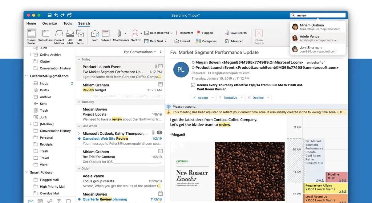
Designing a mail client is a real challenge. People expect so many features, but I wanted to keep things light and intuitive. Here’s what I focused on:
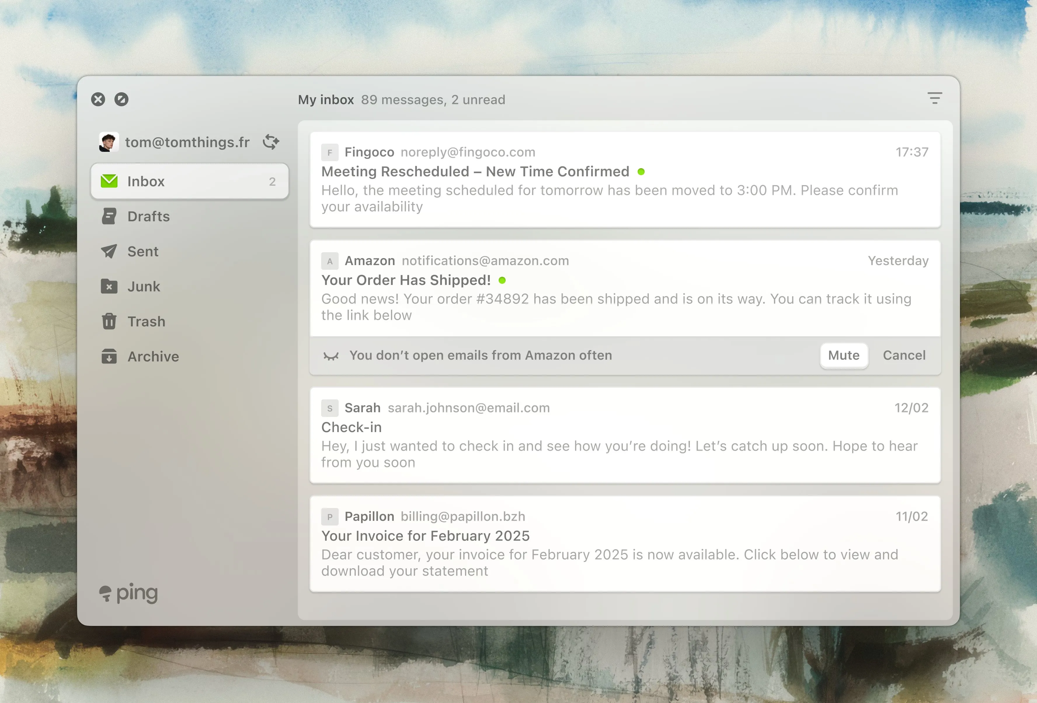
- A sidebar for quick navigation (Inbox, Drafts, Sent, Archive, etc.)
- A super clear message list with simple previews
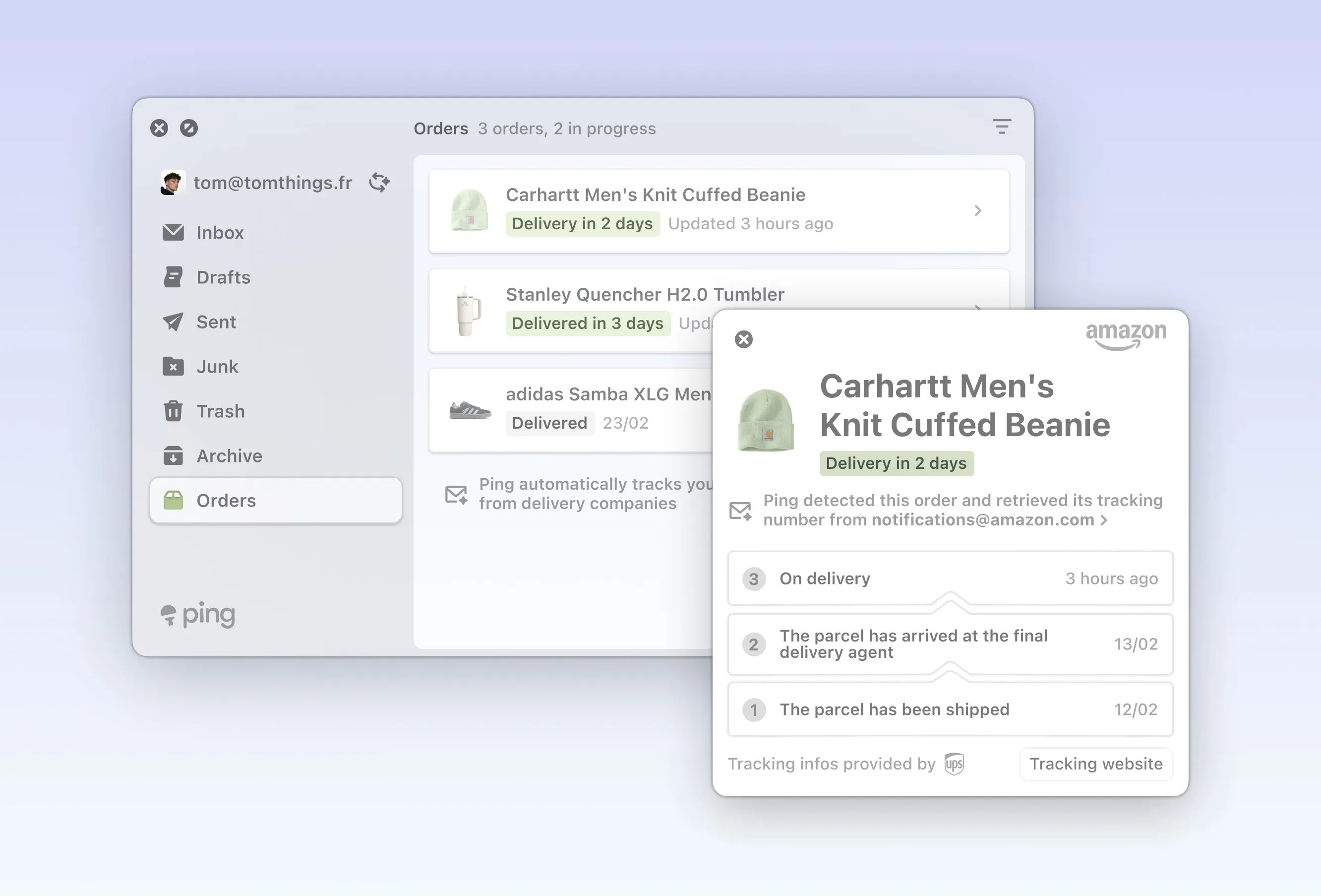
- A smart info panel: When you select a package tracking email, Ping Mail pulls out the important details, like delivery status and estimated dates, and shows them in a clear summary to the right. No need to dig through the email to find what matters.
The interface is calm, with soft colors and plenty of breathing space. Every detail was intentional, and everything came back to the idea of making email effortless.
What I Learned
The hardest part was finding the right balance. Email clients can get complicated fast, and it’s tempting to add feature after feature until things feel overwhelming. I really had to think about what was essential and what could be left out.
I realized that good design is as much about removing the unnecessary as it is about adding new things. Features like automatic order tracking or contextual notifications are useful, but they should never get in the way.
Hopefully, Ping Mail can make email feel a bit more enjoyable and less of a daily hassle.
What’s Next?
Ping Mail is still a concept for now, but development is planned and I can’t wait to see it come to life.