spark: giving student life an identity
Lighting the spark
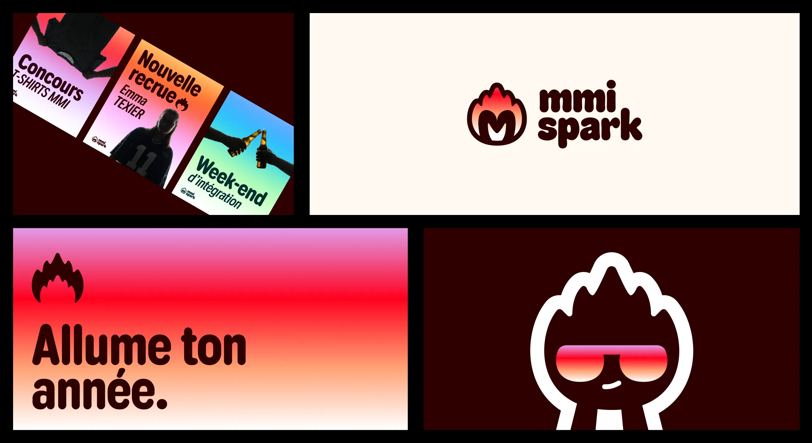
When we created the MMI student association Spark, we were starting from scratch. No logo, no colors, no identity. Just a desire to bring some fire back into student life. The name Spark comes from that: the energy, the buzz of a good party, something that makes you want to show up.
I chose to be vice-president on purpose. It let me keep control over the creative direction without having to carry everything on my own.
Building an identity from nothing
I designed the logo, picked the colors, set the visual tone for Spark. The goal: a student scrolling through Instagram should recognize Spark before even reading the text. Every poster, every post, every story had to belong to the same universe.
It was the first time I built a real visual system, one that was meant to live beyond a single event.
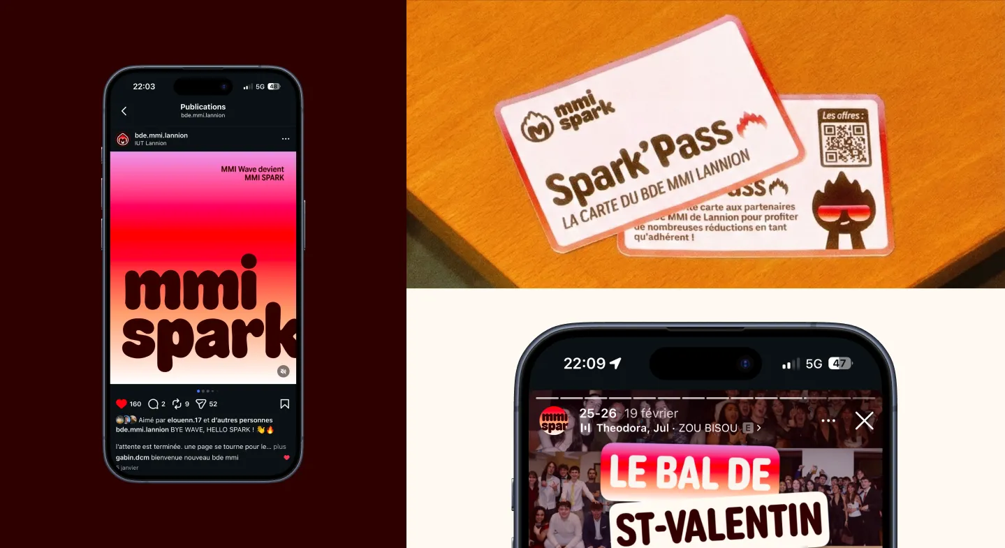
Spark’Pass
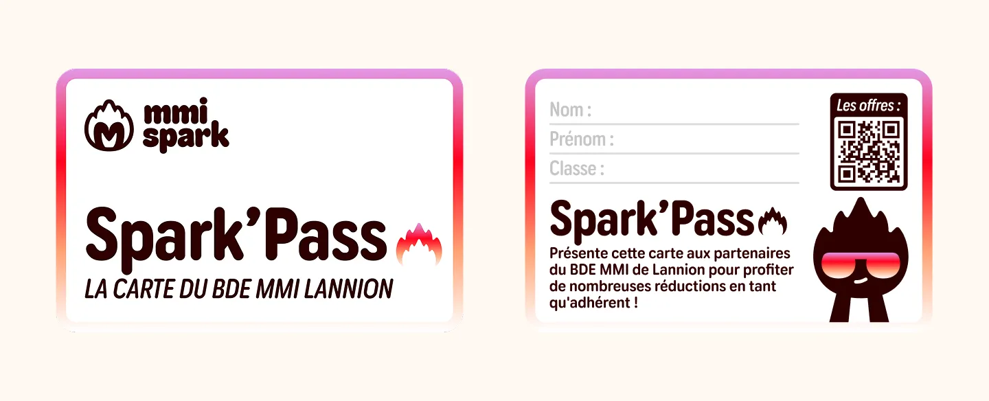
The Spark’Pass is the physical membership card for the student association. I designed the card’s visual. It sounds simple, but designing a physical object that has to be both good-looking and functional is a pretty different exercise from digital.
The website
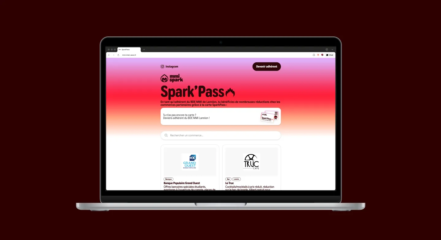
I also designed and developed Spark’s website, which presents the perks of being a member. The goal: make people want to join by keeping the information clear and easy to access.
What I take away from it
Spark is the project where I did a bit of everything. Branding, print, web, e-commerce, management. It’s also where I understood that a visual identity isn’t just a logo. It’s a system that has to hold up on a poster, a phone screen and a plastic card. And that the best way to keep a clear vision is to not try to do everything alone.