designing Papillon
Monday, 08:00. Three nested menus later, I still don't know if maths is first period. That frustration became Papillon, the student app now past a million downloads.
How it all started
The story began on Twitter. After I posted a redesign concept for my school’s website, a developer named Vince replied, saying he lived nearby. We soon became friends and eventually met in person. Vince had already been working on Papillon for a few years. Back then, I was still in high school, and like many others I found Pronote’s interface frustrating and unfriendly. When Vince asked if I’d like to join the team, I immediately said yes, eager to help redesign the user experience.

Bro I’m legit shocked by your twitter post
Like I don’t know if that school was just some random pick or what, but the world’s seriously small, I live like 12 miles from that high school
We dove in head‑first. For a month we called each other almost every evening, brainstorming and building together. My role was clear from the start: I was the project’s visual brain. I designed every screen, thought deeply about overall coherence, and always presented at least two alternatives for each element so the team could choose. This created genuine team momentum but also posed a challenge. Pronote is a huge, complex app, and every new feature raised tough questions about usability, logic, and usefulness.
The problem with Pronote
Open Pronote and you land on the home page, shown on the right. It's the first thing every student sees, and the two things they actually came for, today's timetable and the homework due tomorrow, sit below the fold. What gets the prime real estate instead is a sticky note, a list of external links and a block of upcoming tests. Secondary information, sometimes tertiary, occupying the space that matters most.
The rest follows the same logic. Course contents hide behind three stacked dropdowns before a single lesson appears. The grade report is a wall of numbers with no sense of what's good, what's recent or what counts. Everything is text, everything weighs the same, and nothing guides the eye.
And navigation isn't a tab bar. It's a hamburger menu, a pattern the mobile world moved away from a decade ago because it buries everything behind one tap and tells you nothing about where you can go. Add a layout clearly designed for desktop first and you get an app that costs students time every single morning.
Design is not just what it looks like and feels like. Design is how it works.
Designing the alternative
Redesigning Papillon meant starting with one thing: rethinking the habits. That sounds obvious, but when you've used Pronote since middle school, you forget what a school app could look like. The interface becomes the ceiling of what you imagine possible. So the first job was unlearning it.
Two goals, then, and they pulled in different directions. Build something genuinely faster to use, and build something students would actually want to open. Nobody talks about that second one, but when you're fifteen, having something that looks good in your hands matters.
I started with the fundamental question: what does a student need to see the second they open a school app? The timetable. Between rooms that change, teachers who are out and periods that move, it's the one thing you check every morning. So that's what we put first, above the fold, no scrolling.
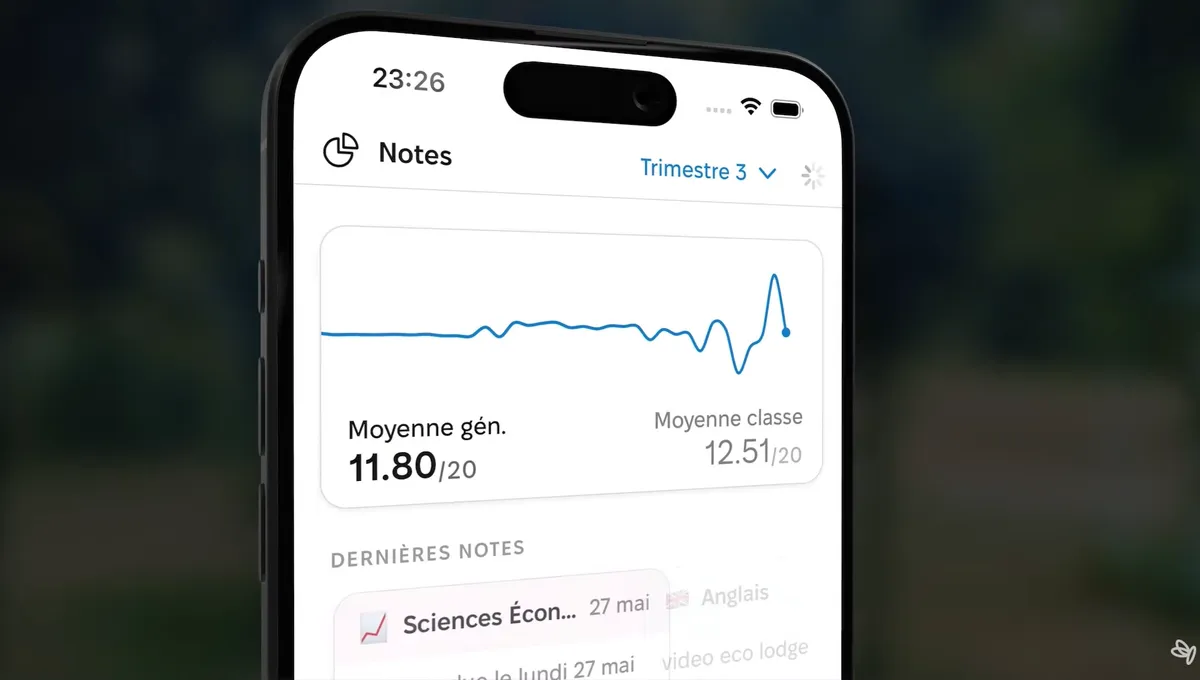
To design it, I went back to how mobile interfaces handle time. I pulled apart Apple's Calendar app in detail: what it shows, what it hides, which details survive at a glance and which ones can wait for a tap. That study shaped the home screen we landed on, a stack of widgets with shortcuts and the timetable up top, then grades and homework underneath, so everything you need in the morning is in one look.
The addition students kept coming back to was the running average, plotted as a curve across the year. Pronote gives you the numbers, one after another, but nothing that shows movement. Seeing your average climb, or dip, turns a list of grades into something you can actually read.
A few practical additions ended up on every page rather than just one: search across your own data, and filters on top of it. Small things, but they're what let a student find one grade from November without scrolling through a term.
Stepping out of my comfort zone
Papillon pushed me far beyond my comfort zone. I had been used to working solo, but suddenly I had to collaborate with a team that already existed before I arrived. They offered tons of advice, and I also had to integrate feedback from users, even from students themselves. It was challenging but incredibly rewarding. I learned to communicate my design decisions more effectively, to stand by my ideas, but also to question them and pivot when necessary.
From side project to viral success
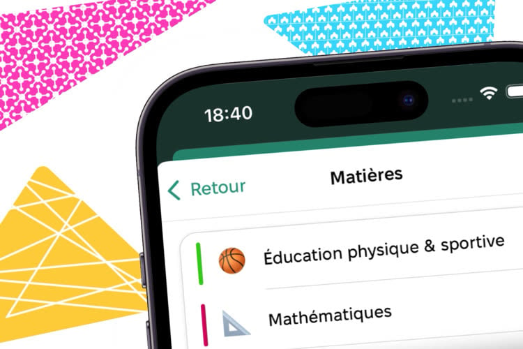
And then… Papillon exploded. We passed the one‑million‑download mark, a real TikTok trend grew around the app, and French media started talking about it. Some users promoted it by saying, “Look how much better this looks than Pronote!” Hearing people appreciate the aesthetic side of the project meant a lot to me. It proved that my work resonated, even without explanation. As a designer, I don’t think there’s a better compliment.
Some press articles about Papillon
Looking Back
Papillon was a turning point for me, both a fantastic human adventure and a true professional learning experience. I had the chance to express myself, learn how to work as part of a team, and see my ideas reach a huge audience. Although I joined after the developers, their feedback helped me grow and find my place.
If I take away one thing from this project, it’s that design matters. When people find beauty and clarity where there was only confusion, it’s something special. And that’s exactly why I love what I do.